How to create reports for business analysis
When you need to analyze data from a large number of records, using a business reporting tool can be a great way to summarize and present your findings. Whether you’re working with sales figures or expenses for an organization, a business reporting tool makes it easy to build and implement reports.
Reports are great because they handle a wide range of statistical analysis tasks and provide you with the information you need to make informed decisions about your business or organization.
With a wide variety of reporting tools available, we’ll be going over basic principles that can be applied in general. In this article, we’ll show best practices for building reports from scratch by creating a simple table and calculating and formatting your data and charts and graphs for a professional finish.

Why use reports for business analysis?
There are a variety of software packages available for business or personal use. Reporting tools provide you with more tools and features for manipulating data and formatting your reports.
Software can be offered in both a desktop and cloud-based option, which you can access from anywhere. Additionally, reporting tools can integrate with other software programs that your business uses on a daily basis, such as Salesforce or QuickBooks.
For business, there’s a wide range of reports that can be created to analyze key points in an organization and make informed decisions accordingly. This information includes revenue and expenses, profit margins, or customer trends.
Part 1: Gathering data for your report
First, you need to gather the data required for your report and put it in a workbook. For this example, consider the following data:
| Country | Number of Employees | Annual Revenue (in USD) |
|---|---|---|
| Canada | 120 | 6,000 |
| Mexico | 80 | 5,500 |
| United States | 200 | 19,000 |
This information is only an example. You can include any number of rows and columns for your data analysis. The size of your table will depend on the kind of report you are trying to create.
For example, if you want to track sales revenue by region over time, there should be multiple column headings for Region 1-3 with one column heading per year (i.e., 2014, 2015, 2016).
Where should my data come from?
The modern business world is a world of big data. Depending on the goals of your report, the sources of your data can vary. For example, if you need to conduct a market analysis on your industry or a competitor, there are articles and research papers that you can use for data sources.
On the other hand, a simple financial report may only require information from internal management systems such as Salesforce or QuickBooks. These days, many people save their personal files on popular cloud-based storage services such as Google Drive and Dropbox.
One benefit of using reports for data development is the ability to connect to real-time databases that keep your information up-to-date. This option is great for organizations that need to monitor sales figures, manage projects, or conduct research studies.
For example, if you want information on the number of people currently subscribed to your email list, you can use an external database such as a CRM which connects directly with your report.
Part 2: formatting the data and creating a table
The data in your report should be easy to read and understand. A well-designed report will present information that helps decision-makers visualize key points and statistics.
First, we want to format our table so that all of our data is in one place, organized by country (Canada, Mexico, and the United States).
Next, we’ll need to calculate the annual revenue for each country. We can use aggregation functions such as ‘SUM’ or ‘COUNT’ for this.
Part 3: adding formulas and calculating data
Now that our data is easy to read, we can use our BI tool to calculate important figures such as averages, percentages, and growth rates. We’ll need the following values in order to complete this step:
- Country Name
- Annual Revenue
- Percentage Growth
First, we’ll create a formula that calculates the percentage of growth for each country. Most software tools have a calculated field option that allows you to type in formulas similar to the ones you would traditionally use in Excel.

Part 4: adding charts and graphs
Formatting your report with charts and graphs is an easy way to visualize important data.
To this point, we have organized our data into one table that calculates values for us. By adding charts, we can highlight important numbers and make it easier for decision-makers to understand what the data is saying.
There are a variety of charts you can utilize, each with its own unique purpose. We’ll add a bar chart to visually display the percentage growth of each country and make it easier for readers to see which countries are performing well. At a quick glance, our readers can now understand which countries are growing faster by comparing the length of the bars.
To finish up the report, you can also add a second chart to displays each country’s annual revenue over time with a line graph. This type of visual does a great job of depicting changes over time.
Once you have created your charts, you can organize them in a way that makes it visually appealing and easy to interpret at a glance. Try placing the most important charts at the top of the page, with the original report underneath to be used as supplemental information.
Part 5: Save and share your report with interested stakeholders
Now that our report is complete, it’s time to share it with colleagues or clients.
Remember, reports should be treated as a living document—meaning it should be updated, grow, and evolve as your business utilizes it. The first thing to do is share it with interested stakeholders, even if you feel it isn’t perfect. You can edit your report and add more information such as headings and changing the formatting of different elements. Modern reporting tools are very versatile and can provide many opportunities for tailoring your reports towards the needs of your audience.
Conclusion
At this point, you are prepared to try out a reporting tool and start building your first report. With some simple practice and advanced formulas, you can begin to build high-quality business intelligence reports and dashboards for nearly any business.
Check out some related resources:

Power BI or Tableau? A Side-by-Side Comparison

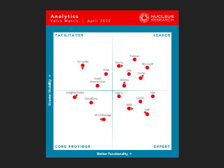
Domo Named a Leader in Nucleus Research’s 2023 Analytics Technology Value Matrix


