Executive decisions made easier with executive dashboards
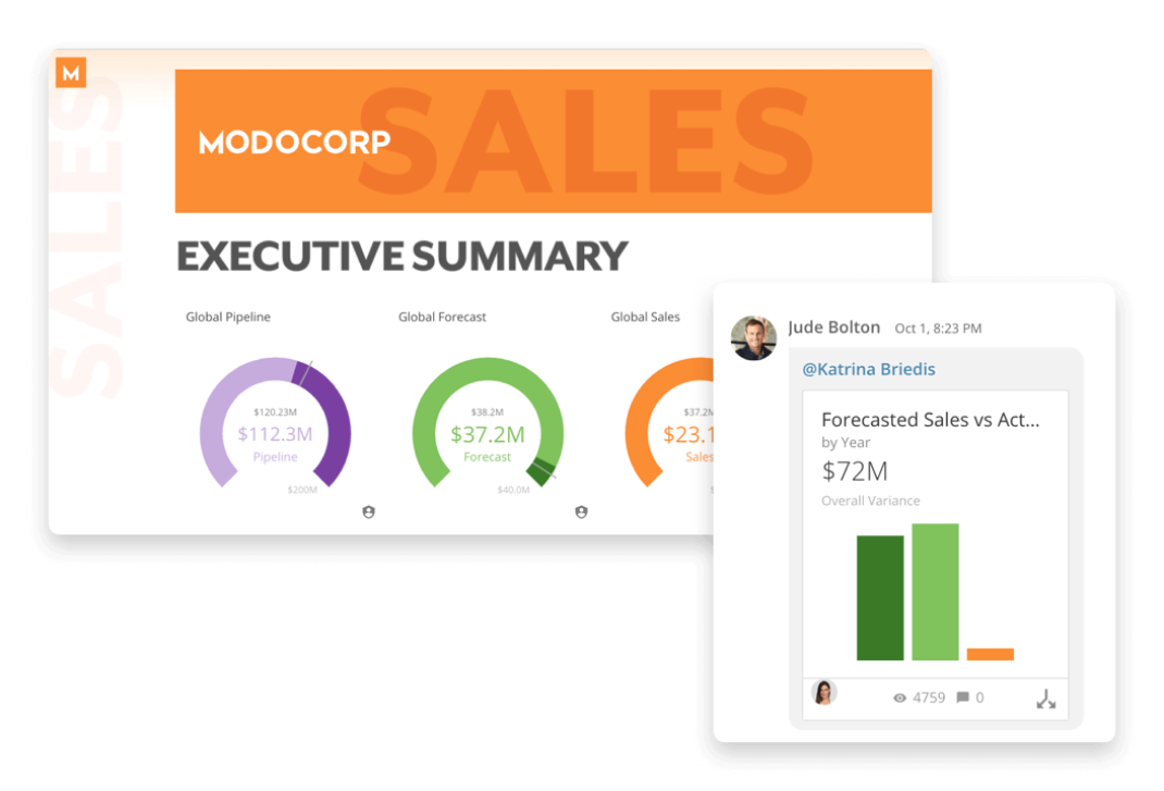
An executive dashboard refers to a reporting tool that visualizes key performance indicators (KPIs) that help corporate executives manage their organizations more efficiently. C-level executives can effectively convey insights and make high-level strategic decisions when they have access to powerful visualizations.
Executive reporting’s easily understandable visual form makes it simple for business leaders to make sense of massive datasets, notice prevailing patterns, and take a variety of decisive actions that benefit the organization. Executives are able to identify gaps and strengths, enhance internal processes, and increase employee engagement to boost profitability.

Dashboard features that are a must-have
Visual features
Customization: You ought to be able to get the data you need and see it in a manner that makes sense to you.
Drag-and-drop interface: With a drag-and-drop interface, you can easily choose which dashboard elements you want to display and where you want them on the page.
Font and color choices: With the flexibility to customize the color and fonts, you can make your dashboards even more appealing and consistent with your company’s brand.
Options for graphics: Aside from the standard chart or gauge, there are numerous ways to display data.
Infrastructure and platform capabilities
Cloud-based: A cloud-based dashboard is simpler to set up and maintain. It can be accessed from any device at any time.
Platform support: If you’re not buying web-based dashboard software, make sure it’ll operate on your machines’ operating systems.
Mobile options: Many dashboard software alternatives provide mobile device access that allows you to examine data on smartphones or tablets.
Data features
Data blending: This method gathers data from a variety of sources and combines it using a specific technique that gives you the data in the format you prefer.
Data extraction: No matter what source your data is from, your data should be accessible. Whether you use a proprietary database to hold your corporate data, the executive dashboard software you choose should be able to connect to it and obtain the data.
User Features
Multi-user: Depending on the dashboard software you choose, the number of users who can access it may be limited.
Ability to share content: It’s beneficial to be able to share executive dashboards with other team members, but it’s also nice to have the ability to restrict the content that some users see.
Collaboration tools: Collaboration options, such as other management as well as project tools, can be advantageous. Dashboard software should contain automation tools including the ability to plan reports and program notifications, in addition to allowing users to write comments, create slideshows, and share vital business information.
Executive dashboards benefits
Assess performance: To take action, evaluate performance in relation to plans. You can measure and enhance performance by having the capacity to monitor performance throughout your organization.
Enhance internal communications: Dashboards are an excellent communication tool since they make it simple to see how the firm and its departments are doing.
Strengthen external communications: Dashboards can help suppliers and customers communicate and interact more quickly.
Save time: Since all the data you require is in one place, a well-designed dashboard saves time.
Improve employee productivity: Employee performance must be consistently and accurately evaluated not only for individual success but also for an organization’s overall success.
Increase profitability: You’ll know where to invest your time, attention, and resources to enhance your outcomes and bottom line once you’ve identified where you need to improve.
Types of Executive Dashboards
CIO dashboard: IT executives can get a quick and accurate overview of their whole IT portfolio.
Finance dashboard: A dashboard is a useful tool for CFOs as well as other executives that need quick financial insights.
Human resources dashboard: From a centralized place, HR leaders can keep track of all people, tasks, projects, and deadlines in real time.
Operations management dashboard: Managers at all levels can keep track of operations to see if they’re on schedule, if their employees are completing duties on time, if they’re staying within their budget, and so on.
Sales and marketing dashboard: The sales and marketing executives can obtain high-level insight into sales activities and progress, as well as key metrics and status, to monitor sales pipeline traffic.

Choosing the most appropriate dashboard for your needs
Executive dashboards are utilized by many different types of managers as firms strive to become more nimble. This tendency reflects the awareness that by providing managers with real-time insights, they’re able to make better decisions more quickly.
Executives and managers should have access to more detailed, analytical dashboards, that provide drill-down functionality for detailed data exploration. This gives them additional insights when needed, instead of just a holistic view of the organization’s status. Because they focus on extracting insights from a vast volume of data gathered over time, analytical dashboards can be more sophisticated than strategic dashboards, which are more high-level.
Consider whether your organization’s executives would like the capability to drill down into more complex visualizations and analytics, or stick with a comprehensive view only.
Best practices for creating executive dashboards
Executive dashboards necessitate careful planning and design up front, but the end product is well worth the effort. Top dashboards are designed with three concepts in mind:
Make it usable
Dashboards should adhere to the same best practices as any other web page, namely, minimal visual clutter and easy navigation. The primary purpose is to obtain clear, concise, goal-oriented data, so the more straightforward the presentation, the better. The user’s learning curve ought to be as short as it can be. Using automated software features, users should be able to complete fundamental analytical tasks. Consider mobile when planning your project. Because so much work is completed on the go, the design should be simple to adapt to a smaller screen.
Make it meaningful
This relates to your dashboard’s use of KPIs as a foundation. Take the time to figure out which data points are most critical to your organization’s success—no more than five key indicators is a good rule of thumb. Your top-level data should be organized so that KPIs and drill-down data are easily accessible. To be highly competitive and efficient, the data underpinning the dashboard should be updated continuously. A dashboard is only as meaningful as the underlying data.
Prompt action
Consider organizing the information generated from KPIs into three categories to take the dashboard to the next level: insights, next steps, and potential impacts. Insights entail extracting meaning from the data. In light of these insights, next steps explain what actions can be taken. Potential consequences are projected outcomes as a result of the suggested actions. Obviously, this method requires more effort, but it will help executive users turn data into action with ease.
Conclusion
The overarching goals of your organization, the culture, and the preferences of the executives will determine which dashboard is the best fit for your company. Executive dashboards not only benefit C-suite business leaders but also have the potential to benefit managers and team members as well.
Check out some related resources:

Power BI or Tableau? A Side-by-Side Comparison

Intro to Domo Workflows: Intelligently Automate Business Processes


