15 Beautiful Data Visualization Examples
When Deloitte works with companies, the consultants often emphasize the need for data visualization. It’s a smart move—visuals are more compelling and can convey a message more memorably in a shorter amount of time. Deloitte lists five reasons why data visualization is vital for companies:
- Data visualization unlocks key values of data sets.
- People can more easily identify patterns in visuals than in numbers.
- Data is easier to understand when presented visually.
- Visuals are more attractive and engaging to users.
- Visuals are helpful for displaying complex relationships.
Data is only as useful as the story it tells. Even if your organization had access to all the data in the world, your team couldn’t make any useful decisions if you didn’t understand it. Data visualization is the key to organizing, understanding, and acting on data. So, following our own advice, we aren’t going to provide statistics or numbers; instead, this article shares 15 data visualization examples.
What is data visualization?
Data visualization is a way of showing data in a graphical or illustrative manner. Data visualization helps represent raw numbers in a format that more quickly and easily conveys meaning. Methods of data visualization can include pictures, maps, line and bar graphs, pie charts, word clouds, and many other forms.
Historically, data visualization is practically as old as people. Ancient humans had methods for drawing maps and conveying mathematical concepts—both of which are kinds of data visualization. This method makes sense, as the human brain can process images 60,000 times faster than it can process text. In a business context, data visualization is not only helpful for internal presentations and working with your teams; it’s also a key way to interact and communicate effectively with customers.
Data visualization examples
How Much Bigger Is $1 Billion Than $1 Million?: The Startup

Numbers are abstract and inherently difficult to understand—including money-related numbers. We had to include this as a good example of data visualization for the illustration of a million versus a billion. Remember the old show Who Wants to Be a Millionaire? The winnings from that show are peanuts compared to the vast wealth of a billionaire. A billion is not just double or triple a million; it involves a different order of magnitude. Most people can’t fathom what that kind of wealth actually means or the kinds of economic implications it comes with. The words “million” and “billion” are only one letter different, but this visualization is one of the easier ways to attempt to show the differences between the concept behind those words and numbers.
History of Pandemics: Visual Capitalist
There’s a lot of data around the COVID-19 pandemic, and the Centers for Disease Control and Prevention (CDC) is still gathering data to understand the virus’ long-term side effects. Still, from what we understand about the pandemic, it’s not the only disease to ravage populations—by far. This infographic is one of the best data visualization examples we’ve seen.
We give it high marks for its clean simplicity. The virus-shaped markers convey the nature of the subject matter just as much as they do population comparisons. The perspective-fading timeline, rather than a simple line from side to side, adds a unique element to the concept of time and historical implication. Colors help differentiate diseases for at-a-glance visual separation.
When charts like this one present data, they are more than just a collection of numbers—they tell a story
When we look at data visualization, suddenly we understand a singular happening within its context—which allows us to see a more holistic picture. For instance, COVID is one of many pandemics over the centuries with a death toll over five million; in fact, the HIV/AIDs epidemic led to five times as many deaths as COVID, and the Bubonic Plague caused over 28 times as many. Visuals like these can help governments and nonprofits decide where to focus aid, how to spend money, and where to direct resources.
Land Use, Mobility, and Inequality in the EU: Data Europa EU

Davide Mancino and Federica Fragapane worked together on this artistic representation of land cover in the European Union. The graphic is broken down into countries, which are then broken down into colors and textures that indicate land cover types, such as cropland, grassland, or artificial land. This illustration puts countries closer together than they would be on a regular map, making comparisons more accessible. Not only is the chart beautiful, it also offers insights into the realities of how land is distributed, how resources are being used, and how land use perpetuates social and economic inequity. Data is never just a set of numbers; it’s a story of what’s really happening, and this is a prime example of that context.
The Rise of Anti-Trans Bills in the US: Reuters
Gender-affirming healthcare is a topic that’s been garnering a lot of discussion in courtrooms. This beautifully illustrated article uses simple lines to indicate the number of bills and pieces of legislation passed that are related to trans rights and gender-affirming healthcare. The lines are delicately woven around the text to provide a seamless, subtle count that changes between paragraphs to underscore the various points throughout the article. We give Reuters top design points for this data visualization.

NASA shares a lot of data with the public. This example is essentially data about the amount of data NASA has. The simple blocks and colors quickly communicate comparisons between different kinds of data, as well as showing subsets within each type. At a quick glance, you can tell that, surprisingly for an air and space administration, there’s a lot more data about Earth’s surface and about outer space than there is about the oceans.
The True Size Of…: Thetruesize.com
If you’ve ever seen an old world map from the 1500s, you might have snickered at the inaccurate shapes of land masses and the many missing places. However, what you might not realize is that our current-day maps are also quite inaccurate. Putting a spherical shape onto a two-dimensional surface inherently distorts the shape of land masses. Thetruesize.com aims to use data to show the true size of different countries and continents. It’s an interesting way to compare two-dimensional areas—a type of data that is so easily misrepresented in common maps. With this website, you can pick certain countries and regions and drag and drop them over each other to compare sizes, which is something even an accurate spherical globe can’t do. For example, most people don’t realize how large Africa is. Its land mass is larger than the US, China, and India combined.
Chart Every Country’s Favorite Book on This Map: Vice

Yes, data visualization can take complicated information and make it simple. But beautiful data visualizations can also take very simple data and make it interesting. This map is a good example of data visualization because it’s memorable. All the information in this map could have been two simple columns in an Excel spreadsheet, with countries in one column and book titles in the other. However, a creator decided to take data and visualize it with book cover art filling in each country.
A Year of Wild Swings: Reuters
Stock markets are almost always represented by simple graphs with a jagged price-per-stock line that forms peaks and valleys. But these artists imagined a different way to visualize stock market trends during 2022. The colors indicate rises or falls in the daily change in yields of 10-year U.S. Treasury notes during trading days. The intensity of the hue shows how positive or negative the change was. It’s a lot of information communicated simply, and the calendar format situates this visual in the context of time. It’s an elegant, humanizing way of matching a timeline of world events with financial ups and downs.
A Sky Map of the Hubble Space Telescope’s Observations: visualcinnamon.com

To make this fascinating map, creator visualcinnamon combined several types of data. They started with three types of wavelength data from the Hubble Space Telescope: optical light, UV light, and infrared wavelengths. Then, on top of that was constellations, stars, 3-D visualizations, and more. The end result is designed to be close to what humans actually see when looking up at the night sky—whether our brains can register the kind of light or not.
Olympus Mons, Mauna Loa, and Mount Everest Compared: Michael_Snowy

You probably know that Mount Everest is the tallest point on Earth. It’s not the largest mountain, though—that would be Mauna Loa in Hawaii. From its base to its summit, Mauna Loa is more than 56,000 feet high, even though only 13,680 feet of it is above sea level. However, if you look outside of this planet, both of these mountains are overshadowed by Olympus Mons on Mars, which stands at 72,000 feet tall. These figures all could have been a bar graph, which would have been easy enough to understand. But this is one of the good examples of data visualization because it represents the data in the form of the shapes of the mountains. This communicates more than just comparative height; the image also conveys mountain volume, geography, and climate.
Interactive Media Bias Chart: Ad Fontes Media

Media watchdog Ad Fontes Media made this chart to show the political bias and reliability of a variety of news outlets. Using the logos of each media outlet as the plot points was a creative choice. Just as impressive, though, is the way Ad Fontes Media incorporated data into the chart. In a sometimes subjective and often uncomfortable industry, politics has few ways to be objectively compared. To gather the data for the chart, the company created its own rating point system. Each piece of news is evaluated by three people: one who identifies as politically right-leaning, one who is left-leaning, and one who is centered. Each person rates the article separately; then, they discuss the scores as a team. Scores are averaged among the three. You can read more about the methodology here. It was an insightful way to quantify usually qualitative data and put it into a data visualization format.
One Year of Global Waste Visualized: Visual Capitalist

It’s often helpful to compare abstract numbers to real-life visuals. In this case, the graphic compares waste to the height of the Burj Khalifa. We’ve got to hand it to the illustrator—this data visualization is gorgeous in the way it shows an ugly problem. The color scheme is intentionally the color of mold and rot, and the piles of garbage against a real city backdrop show the sobering scale of how much waste we produce. It’s much more effective than simply listing waste in billions of tons.
The Countries That Attract the Most Migrants: Statista

Time is tricky to show in data visualizations. Usually, comparing data sets of the same topic from two different times is shown by two separate side-by-side charts, or, at best, different colors on the same chart. Statista not only did a great job illustrating the data surrounding who migrates where, but also did an interesting comparison between the years 2000 and 2020. The lines connecting the two halves of the graph are a simple way to show the changes in rankings.

XKCD is usually a witty and humorous comic. However, this is one of his darker, more serious posts—and it’s a fascinating example of data visualization. The comic’s creator, Randall Munroe, supported his then-fiancee/now-wife when she was diagnosed with stage III breast cancer. As he stayed with her through treatment, he tried to understand the statistics physicians were tossing around—specifically, a 60% survival rate at 10 years. He ended up making this comic, with years of survival as the y-axis. Strips of the visual peel away to represent cancer recurrences, which veer off into darkness to indicate death. Anyone dealing with deadly diseases like cancer knows that statistics are a lot more than just numbers when you’re the one being diagnosed, and this is an excellent representation of what that feels like.
LinkedIn Job Search Technology: CareerBrander.com

Did anyone use LinkedIn InMaps? LinkedIn discontinued the tool around 2014, which is a shame, because it’s a beautiful data visualization example. The idea of the tool was to help you categorize the people in your network. The data points of all your connections created a sort of heatmap that showed where your social groups overlapped and where you therefore had a better chance at connecting with someone who could give you an “in” at a job.
Thankfully, some documentation of InMap still exists. Ian Levine wrote a blog that included his InMap results and explained how it worked. The blue cluster represented his current employer (or, at least, his employer at the time), the green cluster was his home community, and the purple/orange cluster was his previous employer split between regional offices and national headquarters.
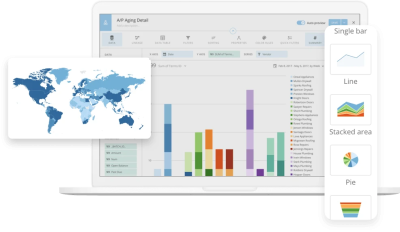
Accelerate your business with data visualization
Tell your story and accelerate your business with data visualization. Domo makes analytics accessible with interactive, customizable dashboards that tell a story with real-time data. Custom apps and tailored workflows mean you have the freedom to create data visualizations that make analysis faster and deeper across teams. To see what the visual experience could look like for you and your organization, request a demo of Domo’s dashboards and analytics tools.
Check out some related resources:

Cloud Data Warehouse Usage Surges 116% as Industries Race to the Cloud

10 Looker Alternatives and Competitors in 2025