Visual Analytics: What It Is, Why It’s Important, and How It’s Used

In today’s data-driven world, making sense of information quickly and effectively is more important than ever. Visual analytics combines advanced analytical techniques with the power of data visualization, enabling users to explore complex data sets through interactive, intuitive visuals.
Visual analytics provides the tools to turn raw data into actionable insight, whether you’re trying to uncover hidden trends, monitor performance in real time, or support strategic decision-making. In this guide, we’ll break down what visual analytics is, why it matters, and how you can use it to unlock the full potential of your data.
Visual analytics vs data visualization
Understanding data visualization
Data visualization is about representing data visually—think charts, graphs, and dashboards. It helps users quickly understand the state of their data, spot trends, and communicate information. These visualizations are often static or predefined, offering snapshots of information rather than the ability to interact with or explore the data deeply.
Understanding visual analytics
Visual analytics is the science of analytical reasoning using interactive visual interfaces. It goes beyond traditional data visualization and combines automated data analysis techniques with visual representation, allowing users to explore complex data sets more deeply. The key advantage of visual analytics is interactivity—it enables users to manipulate the visuals, apply filters, drill into data hierarchies, and uncover hidden patterns or relationships that static charts might miss.
At its core, visual analytics empowers decision-makers to ask more sophisticated questions and receive answers in real time through dynamic visuals. It’s particularly valuable when dealing with large or multidimensional datasets, where extracting meaningful insights through numerical analysis alone can be difficult or time-consuming.
Visual analytics has practical applications across multiple industries. Common use cases include:
- Finance: Fraud detection and market trend analysis.
- Retail: Customer segmentation and sales forecasting.
- Healthcare: Patient data analysis and outcome prediction.
- Cybersecurity: Threat detection and vulnerability analysis.
Tools like Domo, Tableau, Microsoft Power BI, and SAS Visual Analytics offer visual analytics capabilities. These platforms enable users to integrate machine learning, predictive modeling, and real-time data processing to provide a rich, interactive environment where they can combine human intuition with computational power to drive smarter decisions.
Distinguishing visual analytics from data visualization
It’s also important to know that visual analytics is not the same as data visualization. While the terms data visualization and visual analytics are often used interchangeably, they represent different levels of analytical maturity.
Visual analytics, on the other hand, is a more advanced approach. It incorporates interactive data visualization with analytical models and computational techniques. Instead of simply showing what’s happening, visual analytics helps users explore why and what might happen next. It’s a blend of visual storytelling and advanced analytics that supports deeper exploration and more proactive decision-making.
If data visualization is the map, visual analytics is the GPS—it shows you the landscape and guides you through it, adapting in real time as you explore different paths.
Examples of visual analytics
Visual analytics comes in many forms, each suited to different types of data and analytical needs. Each type of visual analytics serves a unique purpose, and the most effective insights often come from combining several forms. The key is choosing the right visualization for the type of data and the question you’re trying to answer.
Here’s a look at some of the most common and powerful types of visual analytics:
Dashboards
Dashboards are one of the most widely used visual analytics tools. They combine multiple visualizations—like charts, metrics, and filters—into a single, interactive interface. Dashboards provide an at-a-glance overview of key performance indicators (KPIs), making them ideal for monitoring business health, tracking goals, and enabling real-time decision-making. Users can click into elements for deeper exploration, making dashboards both broad and deep in functionality.
Charts and graphs
Bar charts, line graphs, and pie charts are foundational elements of data visualization. These basic yet powerful visuals help display trends, comparisons, and proportions in an easily digestible format. Whether you’re visualizing sales over time or comparing categories side by side, charts and graphs are often the starting point for analysis and remain a staple in simple and complex dashboards.
Scatter plots
Scatter plots explore relationships and correlations between two or more numerical variables. By plotting data points on a two-dimensional axis, scatter plots help identify patterns, clusters, and outliers that might not be visible in tabular data. They’re especially useful in uncovering trends in finance, marketing, and scientific research.
Maps
Geospatial visualizations like maps are essential when data includes a location component. Whether tracking shipments, analyzing regional sales, or mapping public health data, visualizing data geographically adds critical context. Interactive map visualizations often allow users to zoom in on specific regions or overlay multiple data layers for richer insights.
Heat maps
Heat maps use color intensity to show the concentration or magnitude of data values across a matrix or spatial area. They’re particularly effective for identifying hotspots or patterns, such as customer activity across a website, foot traffic in a store, or resource usage in a data center. Heat maps provide an immediate visual cue to areas that require attention or further investigation.
Tree maps
Tree maps display hierarchical data as a set of nested rectangles, where the size and color of each block represent different variables. They’re useful for showing parts-to-whole relationships and quickly comparing proportions within categories.
Gantt charts
Gantt charts are essential for visualizing project timelines, tasks, and dependencies. Each task is represented by a horizontal bar, with the position and length indicating the start date, duration, and end date. Gantt charts help project managers and teams track progress, allocate resources, and identify potential bottlenecks or delays. They’re particularly effective in planning complex projects where multiple workstreams need to align over time.
Bullet graphs
Bullet graphs are compact, information-dense visuals used to measure performance against a target. Typically displayed as a horizontal bar, a bullet graph includes a main performance bar, comparative marker (such as a target line), and background shading to indicate performance ranges (like poor, average, or good). They’re often used in dashboards to track KPIs and provide a quick, at-a-glance assessment of whether metrics are meeting expectations.
How visual analytics gives a competitive advantage
Visual analytics provides many opportunities for enterprises wanting to get more value from their data. Here are some of the benefits organizations gain from visual analytics insights:
Enhanced decision-making
Visual analytics accelerates and improves decision-making by turning raw data into meaningful, easy-to-understand visuals. Instead of sifting through spreadsheets or static reports, users can interact with data dashboards to uncover real-time insights.
This ability to explore and query data visually leads to deeper understanding and faster responses. Whether identifying performance bottlenecks or discovering emerging customer trends, visual analytics enables organizations to confidently make informed, evidence-based decisions.
Increased productivity
By streamlining the process of data analysis, visual analytics tools significantly boost productivity. Teams spend less time preparing reports or running manual analyses and more time interpreting results and taking action.
Intuitive interfaces, drag-and-drop features, and real-time updates reduce the reliance on IT or specialized analysts, allowing business users to independently explore data. This self-service model provides faster insights and frees up technical resources for more complex tasks.
Improved collaboration and communication
Visualizations are powerful storytelling tools. They make it easier for teams to communicate insights and align around data-driven strategies. With interactive dashboards and shareable reports, visual analytics promotes transparency and encourages collaboration.
Whether you’re in marketing, operations, or finance, a shared view of the data helps everyone stay on the same page, ask better questions, and contribute to problem-solving more effectively.
Strong market competitiveness
Visual analytics often integrates advanced analytical methods like forecasting, clustering, or machine learning models. These features allow businesses to look back and predict what’s likely to happen next.
For example, sales teams can forecast demand, supply chain managers can anticipate disruptions, and marketers can identify segments most likely to convert.
By turning data into foresight, visual analytics helps companies stay agile, mitigate risks, and seize competitive opportunities early.
Democratized data access
Visual analytics makes data accessible to a wider audience. Users no longer need to be data scientists or SQL experts to gain insights. With user-friendly tools, employees at all levels can explore trends, test hypotheses, and answer questions on their own.
This democratization of data fosters a culture of curiosity and accountability, where insights are not siloed but shared—and where better decisions are made at every level of the organization.
How organizations use visual analytics
Visual analytics plays a pivotal role across various business functions, helping teams translate raw data into insights that drive better outcomes. Here are some key areas where visual analytics makes a meaningful impact:
Sales
In sales, visual analytics empowers teams to monitor performance, forecast revenue, and optimize strategies in real time. Dashboards can show pipeline status, deal velocity, win rates, and quota attainment across territories or reps.
By drilling down into customer segments, product lines, or sales stages, managers can quickly identify what’s working—and where there may be gaps. Predictive visual analytics can also help forecast future sales, highlight high-value leads, and guide strategic decision-making to boost conversions.
Supply chain
Supply chain operations benefit greatly from visual analytics by making complex logistics data more understandable and actionable. Interactive dashboards can display real-time data on inventory levels, shipment statuses, supplier performance, and production timelines.
Visual tools like maps and Gantt charts can help identify bottlenecks, forecast demand fluctuations, and optimize delivery routes. By combining historical trends with predictive modeling, companies can proactively manage risk, reduce delays, and improve overall supply chain efficiency.
Business intelligence
Business intelligence (BI) is perhaps the most expansive use case for visual analytics. Organizations rely on BI dashboards and reports to monitor KPIs across finance, marketing, HR, and operations. Visual analytics enhances BI by enabling non-technical users to interact with data—applying filters, slicing by dimensions, or exploring trends without writing code.
This self-service access accelerates decision-making, breaks down data silos, and fosters a culture where insights are shared and acted upon at every level.
Finance
In finance, visual analytics helps teams make faster, more informed decisions by transforming complex financial data into clear, interactive visuals. From tracking revenue and expenses to monitoring cash flow, budgets, and forecasts, finance professionals can use dashboards to keep a pulse on high-level performance and granular details.
Visualizations like trend lines, variance charts, and bullet graphs help highlight deviations from budget, identify cost-saving opportunities, and assess financial risk. With the ability to drill into transaction-level data or compare performance across time periods or business units, finance teams gain deeper insight and agility in planning and strategy.
What to look for in a visual analytics tool
There are hundreds of visual analytics tools out there. The one that’s right for you depends on your company, unique goals, and existing infrastructure. Here are some features of high-quality visual analytics tools:
- User-friendly interface. Look for drag-and-drop functionality, intuitive navigation, and clean design—especially for non-technical users.
- Interactivity. The ability to filter, drill down, zoom, and manipulate visuals in real time is essential for exploratory analysis.
- Data connectivity. Ensure the tool supports integration with a wide variety of data sources, like SQL databases, cloud services, Excel, and APIs.
- Customizable dashboards and visuals. You’ll need flexibility to tailor visuals to your organization’s specific metrics, KPIs, and brand style.
- Advanced analytics capabilities. If you’re serious about data, look for a tool that has support for forecasting, clustering, trend lines, and integration with machine learning models if needed.
- Collaboration features. Options to share dashboards, comment, or collaborate within the platform can enhance team workflows.
- Mobile accessibility. Dashboards should be viewable and interactive on tablets and smartphones for on-the-go insights.
- Security and permissions control. Look for the ability to manage user roles, control access to sensitive data, and ensure compliance with security standards.
- Scalability and performance. Choose a tool that can handle large data sets efficiently and grow with your organization’s needs.
- Export and sharing options. Look for export formats (PDF, image, CSV), scheduled email reports, and easy sharing links or embed options.
- Strong community and support. A large user community, learning resources, and responsive technical support are valuable for troubleshooting and growth.
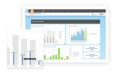
Visual analytics with Domo
Turn complex sets of data into meaningful visualizations with just a few clicks. With Domo’s powerful visual analytics tools, you can find insights quickly. Our advanced tools offer over 150 chart types, so you can always find and express your goals through visual analytics.
To see how our visual analytics tool looks in action, watch a free demo now.
Check out some related resources:

10 Best Data Visualization Tools for Marketers in 2025

10 Best Automated Reporting Tools for Your Business in 2025