Saved 100s of hours of manual processes when predicting game viewership when using Domo’s automated dataflow engine.

For executives in today’s market, the ability to make informed decisions is a requirement. When decisions hinge on the numbers supporting them, you need to provide your executives with high-quality executive-level reporting dashboards so they can make the best possible calls.
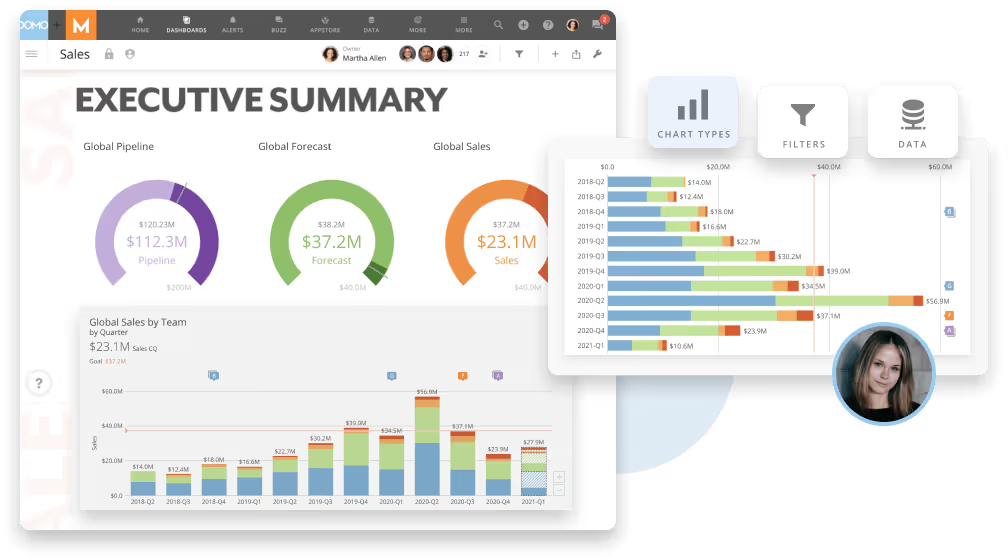
One of the best ways to present the information is with reporting dashboards. A good executive-level report will present all of the important data at a glance, allowing executives to see exactly what they need without having to sift through superfluous information.
How can you best create an executive-level reporting dashboard? In this article, we will detail the process of creating powerful and impactful reporting dashboards that turn tangible data into practical—and actionable—information.
By the end of the article, you will know exactly how to create an executive-level reporting dashboard so that your executives can efficiently make better business decisions.

Before we get into how to create an executive-level report, we should first explain what a reporting dashboard is.
A reporting dashboard is a tool that combines several analytics reports into one cohesive product. It provides executives with real-time information, gleaned from the overall data of the company.
Acting as an aggregate view of all the numbers in your organization, this type of report provides your decision-makers with all of the information they need to make informed choices.
Reporting dashboards can include a variety of types of information in an easy-to-understand format. Often, the reports included a focus on financial data; however, other types of information can be included as well to provide a more comprehensive view of the business.
Reporting dashboards can include data such as:
This article will focus on the first two types of information listed above to provide an executive overview of how to create reporting dashboards that help executives make informed decisions for their company’s bottom line.
Before we get into the details of how to create an executive-level report, we should first explain why reporting dashboards are valuable.
As mentioned above, reporting dashboards provide key decision-makers with all of the information they need at a glance. The more data that executives have access to, the better their chances of making informed choices.
However, as time goes on, executives can become overwhelmed with information overload. This is where reporting dashboards truly shine—they simplify the data into an easily digestible form that allows executives to quickly see all of the important numbers, rather than just a few.
This type of report provides your key decision-makers with a strong basis for making decisions across a wide range of areas, including:
An executive-level report can be combined with other kinds of reports to provide key decision-makers with the information they need to make informed choices.

An effective executive-level report requires more than just data. Instead, it requires effective communication of important metrics in a way that’s easy for executives to process at a glance.
The following six steps will detail the main points of how to create executive-level reporting dashboards:
The first step is to determine the purpose of your reporting dashboard. What do you want the executives who use this report to take away from it?
Examples include:
Once you’ve established the purpose of your reporting dashboard, determine which metrics are most important to achieve this goal. These should be numerical measurements that tell a story and clearly demonstrate how the company is doing and if there needs to be any action taken.
There are several ways to collect data for an executive-level reporting dashboard. Some data can be pulled directly from your company’s databases, while other information is found in industry reports.
The following are some potential sources of data:
By now, you should have a good idea of what metrics you want to include in your reporting dashboard and which data sources contain this information.
Now that you know the purpose of your report and the main KPIs that you need, it’s time to turn those key performance indicators into charts or graphs. This will provide a visual representation of your KPIs.
For example, if you want to demonstrate an increase in revenue, a pie chart might be the best way to go. If the data shows that one product has increased in revenue over time, a line graph will help to compare and contrast this information with other products and their corresponding gain/loss in revenue.

Before you create your report, consider what type of information is most important and how it can best be visually represented. The system or software you use to build your report will determine the type of design that is possible, so it’s helpful to know which software you can use and what is appropriate for your report.
A spreadsheet will offer far different capabilities than an analytics-driven dashboard solution. Depending on your data and the system you use, different options may be available for your report.
As you design your reporting dashboard, keep these tips in mind:
Include your key stakeholders in the design process. This will help ensure that your reporting dashboard accurately and effectively communicates the information to its intended users and recipients.
Open up a dialogue with those who will use this report so that they can provide input on how it should look and what messages they want to receive. This will also allow you to hear their feedback and suggestions about how the reporting dashboard could be improved.
The last thing you want with a reporting dashboard is for it to be met with confusion or lack of interest. If those who will be receiving the reports aren’t happy with them, they will likely opt to not use this information.
If you’re creating an executive-level reporting dashboard, it means that many people in your company will need to see it on a regular basis. With so much information to cover, this can be difficult to do manually.
Manual distribution also increases the risk of mistakes and omissions. This is why most people turn to automated solutions that allow for instant access to updated information.
Some of the benefits of choosing an automated solution include:
One of the most critical aspects of the adoption of reporting dashboards is continuous improvement. These reports are designed for executives and those in upper management positions, so they should be kept up to date with the most current information available.
The needs of your company will change over time, as will the focus and metrics that matter most to it. Make sure you’re revising and updating these key components regularly and not just once per year.
The key to making reporting dashboards work is to understand your audience and what they need from these reports. Knowing how they’re used, who will be receiving them, and what information needs to be included will help you create a report that meets all of its stakeholders’ needs.
Domo transforms the way these companies manage business.


