Building better Excel dashboards with business intelligence
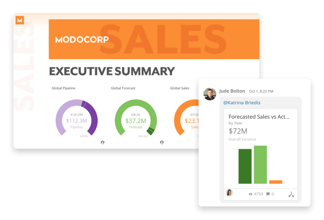
In the world of business intelligence, a dashboard is an effective tool for measuring, analyzing, and making better business decisions.
In a dashboard, you can display live updates of the key metrics related to your business. It allows you to stay updated about your business performance throughout your day.
There are many tools available in the market that allow you to build BI dashboards without coding. But what if you want to build a simple BI dashboard? Can you achieve the same level of functionality without writing a single line of code?
Many business users are now seeking ways to build their own dashboards. They don’t need an IT team or data analyst to do so. With the help of some basic spreadsheet functions, they can build simple BI dashboards for their own use.
This article will cover the complete process required to build a basic BI dashboard—and how you can customize it as well.

Why use BI dashboards at all?
Whether you are a small business owner or an executive at a mid-sized organization, BI Dashboards can be used for various purposes.
BI dashboards can be used to track business KPIs, compare team performance, measure the progress of a project, or even monitor competitor activity.
Here are some common questions that will help you decide what kind of dashboard you need:
- What is important for my business? How can I improve its performance?
- Where do we stand in comparison with competitors? Where do we lose out?
- What progress has been made in the last meeting and what needs to be done next?
The purpose of a BI dashboard is to answer these questions through live updates that are easy to understand. So, whether you need it for business or personal purposes.
Can I purchase pre-built BI dashboard software?
To meet the overwhelming demand for BI dashboards, many companies offer ready-made BI dashboard software. These tools usually come with a pre-defined set of functions and features.
SaaS companies have designed software to target the masses. These tools usually provide you with pre-defined templates for various functions, interactions, and visualizations.
Dashboard vs. reports: what is the difference?
Before we continue, let’s understand the difference between a dashboard and a report. While reports are part of the dashboard, they are not identical to it.
While reports present single or multiple data points, dashboards provide access to consolidated information including (but not limited to) analysis, data visualization, and other interactive features.
A BI dashboard can be static (displaying live data and then updating it automatically) or interactive (allowing the user to make changes). The best dashboards also provide instant access to information. This can include automatic drill-downs, the ability to pinpoint the exact data point you need, and much more.
This is exactly what we will be discussing in this article—a simple dashboard that provides consolidated information on key metrics. You can also configure it to display instant updates without refreshing the entire sheet every time.

How to build a BI dashboard
If you are ready to take advantage of the benefits of BI dashboards, you should know that it is not a tough job. You can create a simple dashboard by following some basic steps.
Step 1: Get your data ready
The first step in the process of building a BI dashboard is to know what data you have and how it is structured. The data you have could be in the form of a table (or an external data source like a database).
At this stage, it is important to understand what you need your dashboard to show. You can then create a list that will include information such as metrics for each department, key performance indicators, milestones achieved, and much more. The main aim should be to design a data model that matches your requirement at hand.
Step 2: Know your goals and outcome expectations
As discussed earlier, the BI dashboard you have designed for your business should be able to answer questions that are important to you. So, what are your goals? What is the purpose of this BI dashboard?
To make it easier for you to decide, here are some common examples:
- What are the key metrics required by my company or investors?
- Do we have a track record that shows how much progress has been made towards our goal?
- Are we ready for investment? How do we compare with competitors, what are the key strengths and weaknesses?
Based on your goals, you should decide which metrics will be included in the BI dashboard. For the purposes of our guide, we will group these metrics into four main categories:
- Customers: This category includes metrics related to the success of your company. A good example would be the number of active clients, customer satisfaction, churn rate, and so on.
- Profitability: This category includes metrics related to how profitable you are as a company. A good example would include net profit margin, fixed assets turnover ratio, etc.
- Operational metrics: These metrics are usually related to how well your employees are running the company. A good example would be average response time, inbound support calls or emails in a given period of time, etc.
- Strategy: This category includes all the long-term metrics that will indicate how successful your company will be in the future. A good example would include Annual EPS growth, Return on Equity (ROE), and much more.
Step 3: Arrange your data in a tabular format
Once you have decided on the basic layout of the dashboard, it’s time to create a tabular model of your data.
This means that you should put all your data in a table format before starting the dashboard building process.
You should be careful about the structure of your data—put field names in the first row, followed by actual data. You can play around with formatting cells to improve readability, but make sure you keep things simple for now.

Step 4: Connect your data with an appropriate chart or visualization
At this stage, you have all the relevant information in one place. Now it’s time to design a chart that will provide consolidated information on each of the metrics that are important for your company.
It is also important to decide what type of chart would be best for your data. For example, if you are showing growth over time, a line chart would be better than anything else because it will visually indicate the rate of change.
Now that you have your worksheet with all the relevant information and the appropriate chart chosen for each category, it is time to combine them both into one dashboard.
Step 5: Combine all the individual charts into one dashboard
The final step in building a BI dashboard is to put everything together.
You need to experiment a little to find the best type of chart for your data. If it is not clear, you can always change the chart type as well as other design elements such as color and font styles.
You will now have a fully functional BI dashboard that you can use to track different metrics relevant to your company. You can also decide how often to refresh the data and include it in a report, email it to colleagues or save it as a PDF file.
Step 6: Share your dashboard with the relevant stakeholders
Once you are done with building your BI dashboard, you can distribute it however you want to. If the dashboard is relevant for other people in the company, make sure to share it with them. They will surely appreciate your effort and you will be able to work more efficiently as a team.
The key to building a BI dashboard is to have all the relevant information in one place. This allows you to see important trends at a glance, and make more informed decisions for your business.
Conclusion
BI dashboards can provide tremendous value to your business. By using similar techniques to Excel dashboards, you can easily create a fully functional BI dashboard. This dashboard can be viewed and updated as needed by your team. The main goal of any dashboard is to provide useful business insights and make the company run smoother and more efficiently.
Once you have a single source of truth data and charts, it’s easy to distribute them to the people that need them. If you followed the steps above, building a BI dashboard should be relatively easy for you.
Check out some related resources:

Domo Named a Leader in Nucleus Research’s 2023 Analytics Technology Value Matrix

Elevate Your Organization's Data-Driven Culture with Strong Governance Practices


