Data Visualization with Radar Charts
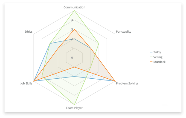
A useful tool to find outliers or similarities, radar charts can be an interesting data visualization tool. Also known as spider charts, polar charts, or star charts, they have a unique shape that separates them from other chart types. More complex than many other data visualizations, when done right a radar chart can easily convey important information across multiple values.
Radar charts use a radial grid to display data. Each category has an axis arranged around a central point, spaced equally around the grid. Concentric circles going out from the center mark the scale values with the higher data points farther from the center. Multiple variables can be charted, but they all need to be on the same scale.
Each category is plotted at a vertex (or corner) of the grid and the shape will vary depending on the number of categories used. With only three categories the grid will be triangular. With six, it will be hexagonal. A line is drawn connecting each value across categories, creating a unique polygon plotted area. Additional data series are overlaid within the graph.
This visualization requires three columns (or rows) of data: one for categories, one for values, and one for series.
While not suitable for every type of data analysis, a radar chart has many unique attributes that make it an excellent tool for comparing data sets within your organization.
When Should You Use a Radar Chart?
You should use a radar chart when you want to show the relationship between a large number of categories and highlight outliers (data points that stand out significantly from the rest of the data set). Look for plot areas with a balloon out or a cave in to identify key data points.
Radar charts are helpful for business cases where a decision needs to be made by comparing two or three objects. This visualization allows you to see at a glance where each person or object is at for each category and how it contrasts with the comparison.
One effective way to use a radar chart is to compare a single person to a group or a skill level. For example, you could compare how a sales development representative’s performance on KPIs compares to the average for the group. A radar chart will visualize areas where they are outperforming the team and those where they could use more training. It helps answer the questions ‘How is this individual performing?’ and ‘What should I include in the next team training?’.
Another example includes charting basic competencies in programming languages for developers. Then compare their knowledge to an internal standard level. For example, a company could require each senior developer on the team to be competent in the core programming languages used. A radar chart will show if each team member meets that standard or not. Managers can establish internal coding camps to improve familiarity with consistently low-scoring languages.
Using a Radar Chart Visualization in Your Business
Though not as common as other visualization tools, radar charts can be used to visualize data from every department in a company. Some examples of when a radar chart could be effective include:
- Enablement program planning. Use a radar chart to see team members’ competencies in key business areas. Then plan training courses targeted to weak areas.
- Product satisfaction scoring. Use a radar chart to plot how a product scores against a competitive market standard. You will then see the product’s strengths and weaknesses compared to the average.
- Store location management. Chart how a new store is performing compared to a well-established store. Correct any early deficiencies in performance.
- Candidate evaluation. Evaluate 2-3 candidates against each other for a job opening. Compare technical competence alongside more intangible skills like friendliness, punctuality, and confidence.
- Track spending. Use a radar chart to find variances between budget and spending on different line items.
Be conscious of the business purpose of using a radar chart. For each example above, another chart type may convey different and more valuable information.
Building a Visualization Dashboard with a Radar Chart
Radar charts are most effective when used sparingly. One great weakness of radar charts is that they cannot convey subtlety within a data set. When using a radar chart in a dashboard, combine it with other data visualization tools to tell a more compelling story with your data. Use another chart type to hone in on less extreme trends while a radar chart highlights outliers.
For example, create a period-over-period chart showing spending by department over the last several years. Then use a radar chart to visualize budget versus spend by each department for the last year. Add a forecasting chart to understand what will be available for future budgets. With the combined visualizations, it will be obvious where budgets need to be adjusted and which departments are chronically exceeding their allotted resources.
If you need to compare many data points, consider using multiple radar charts within a dashboard. You can see performance across the team in one place and identify areas of strength or disadvantage for each team member. You can also generally compare performance by noting commonalities in the size and shape of the plot areas.
Best Practices for Using a Radar Chart
There are some key points to consider when utilizing a radar chart to visualize your metrics.
Don’t overuse it
Radar charts are a complex visualization and can be confusing. Comparing data points around a circle is more visually difficult than on a single, straight line. The key is to know what message you’re trying to communicate. Use a radar chart in your dashboards when its strengths (outliers and comparisons) are going to be effective.
Reduce visual overcrowding
Radar charts can have a lot going on visually with axis lines, variable lines, and plotted areas. Analyzing more than two or three data points would make it nearly impossible to get any meaning out of the chart. Use a radar chart to compare at most three data points or consider using another chart type.
Use transparency
If you’re analyzing more than one data set, use enough transparency on overlapping plots to ensure you’re viewing all the charted data.
The radar chart can be an interesting tool you use for data visualization. With its unique appearance, it can add interesting depth to some key data points. Use it sparingly and always consider if the data will be best served in another chart type. To learn more about other charts and data visualization techniques, see our articles below.
RELATED RESOURCES
chart
Gantt Charts

chart
Forecasting Charts

chart
Bubble Charts

chart
