Data Visualization with Pie Charts
One of the easiest charts to build and read, a pie chart displays data as parts of a whole. A pie chart is a circular graph that divides data into individual parts called slices or wedges. These slices are shaped like pieces of a pie.
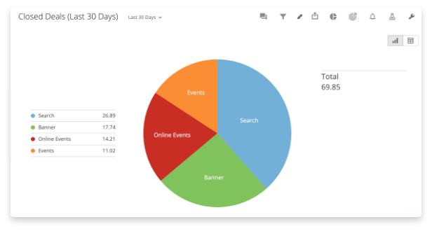
Each “slice” of a pie chart displays data as a percentage of a whole, with larger values having correspondingly larger slices. Pie charts will always have values that add up to 100% of the total. They are good at showing data relationships when you want to see how an object acts as part of the whole or a percentage of the whole.
To build a pie chart you only need two columns of data. The first column will include the names of each section. The second will identify the numerical values of each section. You don’t need to know the percentage of these values up front. The charting tool will make those calculations for you.
When Should You Use a Pie Chart?
Pie charts are widely used, though they do have some detractors.
People like pie charts because they’re easy to create. Plus, scientific studies have shown that our eyes are naturally drawn to circular shapes, meaning readers are likely to look at a pie chart first on a report with other chart types. Plus, the circle quickly conveys meaning to the reader — everything will add up to 100%.
However, pie chart detractors are quick to point out that people are not good at visually comparing the area size. If some of the sections of your pie chart are similar in size, readers will not be able to tell which is larger or what the relative value of the whole each has (unless they’re labeled with their value). Plus, pie charts are often overused and applied to data sets where the visualization doesn’t make sense or add value.
Use a pie chart when you have a small number of data points (2-3) that are significantly different. Pie charts are good at showing what a fraction of something looks like. For example, use a pie chart to show the number of employees who have completed online training with those who are currently working through it and those who have not yet started. It can help you answer the question, “Have I done enough to encourage people to complete this training?”
Ways a Pie Chart Can Support Your BI
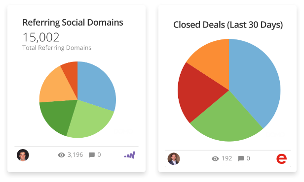
You can use pie charts to help inform business decisions for a wide range of use cases across departments, such as:
- Track top-performers. Use a pie chart to track revenue across multiple store locations and see if one store has a greater percentage of total revenue than others. Or compare how team members are contributing to bug fixes.
- Visualize areas of growth. Use a pie chart to show what product or region is contributing the most (or the least) to growing profits.
- See customer types. Track which customer types contribute most to revenue. Compare new customers, existing customers, reactivated customers, and referrals to see what percentage they contribute.
- Show survey responses. Visualize the results of a simple survey. For example, use a pie chart to show how employees voted in a survey about what kinds of employee perks they’d like to add. The results can show what is most important to your employee population.
Pie charts are useful at conveying two types of information: displaying counts of a whole or displaying percentages of a sum. If you’re looking to see how percentages compare or what part a single data point has of the whole dataset, then a pie chart will be the right choice for you.
Using a Pie Chart in a Dashboard
Consider using a pie chart in a dashboard with other chart types. These other chart types can support the story behind the data in your pie chart by adding historical context or detailing nuances. For example, use a pie chart to show how a suite of products performed in revenue last quarter. Pair it with a bar chart showing historical sales trends and a radar chart tracking consumer sentiment about the products.
Or, use a pie chart to show where your remote workforce lives. A pie chart will quickly convey the most common states. Pair it with a map chart to see a geographical distribution of employees and how far-reaching your company footprint is.
Top Tips When Building a Pie Chart
There are some key points to consider when utilizing a pie chart to visualize your metrics.
Avoid 3D Pie Charts.
While you may think it looks cool to shake things up on your reports or presentation with a 3D chart, don’t do it. 3D pie charts distort the data and make it really difficult for the reader to understand which piece of the pie is the biggest. Objects in the foreground (or front) will appear bigger than their respective value and will make it harder to interpret the data on your chart.
Order Your Data from Largest to Smallest.
Order your data with the largest slice starting at the “12 o’clock” position on the top of your pie chart. Each corresponding smaller piece will follow clockwise around the circle. This will increase the readability of your chart and reduce the reader’s work in comparing two similar sizes to see which is larger or smaller.
Don’t Use Too Many Sections.
We’ve all seen the pie charts with so many data categories that the last few slices of less than one percent all seem to blend together into one indistinguishable multi-colored piece. This makes your data unreadable and diminishes the power of your data visualization. Limit the number of categories on your pie chart to 5 or fewer. If you have additional data, consider grouping it into an “other” category.
Put Labels on Your Slices.
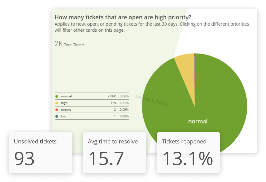
Remember how your readers can’t easily gauge and compare the area size of a slice? Adding a label with a percentage or a value will help readers get insight faster.
Pie charts may have their detractors, but they are an excellent way to compare parts of something to a whole. Because of their wide use and readability, these easy-to-create charts will be a powerful tool as you visualize your BI.
RELATED RESOURCES
chart
Map Charts

chart
Bar Charts

chart
Bubble Charts

chart