Data Visualization with Forecasting Charts
A key graph used by company leaders, finance teams, and investors to estimate the future of a company, a forecasting chart is a critical data visualization tool for modern business intelligence.
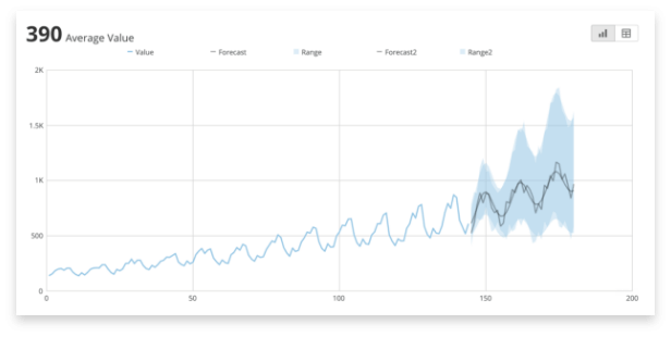
A forecasting chart visualizes past data over a specific period and includes a trendline that continues past the current data to show predicted changes in the future. This trendline can include optional upper and lower bounds, highlighting a range of possible outcomes.
To build a forecasting chart you need at least three columns of data. One column is the X coordinates on the chart, most often a timeline extending into the future. Another column includes Y coordinate values for the main trendline. The third column requires the Y coordinate values for the forecasted trendline. Additional columns of data can be used to show an upper and lower bound for the forecasted period and another column can be included for a second trendline.
A forecasting chart is a critical data visualization tool allowing businesses to see how past trends can help your company objectively look to the future. These charts can inform the effect different business decisions can have on the company and will provide a more transparent process into decision-making.
When Should You Use a Forecasting Chart?
Forecasting charts for future performance are based on historical data and assumptions your company makes about the market and performance moving forward. Forecasting charts inform business planning and decisions. The impacts of forecasting affect every department and give businesses a foundation to build on when answering common business questions.
For example, your company may be asking ‘How much inventory do we need to have on hand for this product?’. Using a forecasting visualization helps all teams understand and plan toward a common estimate, allowing production, supply chain, and logistics to make plans for output and storage. Or questions like ‘What should the marketing team focus on?’ can be answered by aligning the department’s goals with current forecasts. If sales are predicted to go up around holidays, the marketing team can plan campaigns to enhance those sales periods.
Forecasting charts can be useful to just predict the future, allowing companies to use educated guesses to plan budgets, expenses, and sales. But they can really shine when you use them to predict how certain decisions can impact the future. Use a forecasting visualization tool to support decision-making in business planning. A forecasting chart can estimate what effect on revenue a new strategy will have. It can answer questions like ‘How will hiring more resources for the product development team affect operational costs?’ or ‘What benefits could expanding into a new geographic market have?’.
Common Business Scenarios for using a Forecasting Chart
You can use forecasting charts to help inform business decisions for a wide range of use cases across departments, including:
- Targeting sales performance. A popular tool for predicting future growth, use a forecasting chart to establish revenue goals for the sales team. Quarterly goals can be established based on the trendline while stretch goals and additional compensation can be rewarded based on the upper bound of the forecasting chart.
- Understanding product performance. A product manager can use a forecasting chart to visualize the growth or decline of a product in a specific market. Their knowledge of customer purchasing behaviors and market demand along with historical trends will inform the forecasts and support upstream business processes.
- Establish hiring trends. You can use data on financial forecast goals, the average revenue each client provides, the average revenue each salesperson pulls in, the average number of clients supported by a customer success rep, and many other variables, to calculate how many additional people will need to be hired to reach goals. An HR team can use a forecasting chart to predict both when talent will need to be hired and what personnel costs will look like as teams grow.
- Predicting future workload. Calculate the average number of support ticket requests per customer. Then use the sales department’s estimation of the number of new clients they will sign to contract for the next year. Use a forecasting chart to understand the potential volume of support requests with the upper bound highlighting high-demand customers and the lower bound accounting for attrition from current customers.
Using a Forecasting Chart in a Dashboard
Forecasting charts will be an important element in your business intelligence dashboard. Because they create the foundation most goals will be built on, this versatile chart will help inform most data visualization tools your company uses.
For example, by making a forecasting chart visualization the center of a sales performance dashboard, each team member will be able to see how their performance is measuring up to their forecasted goals. Combine it with other charts visualizing pipeline and deals at each stage of the buying process, how team members are performing against other KPIs, and a map detailing sales regions for each rep to get a full picture of performance.
A forecasting chart can also be used as part of a dashboard effort to visualize progress toward goals. Use it to reward top performers exceeding forecasted expectations.
Best Practices for Using a Forecasting Chart
There are some key points to consider when utilizing a forecasting chart to visualize your metrics.
Don’t treat forecasting charts as truth
Forecast charts are essentially guesses. They cannot predict every variable and cannot give a definitive path forward for a company or a department. Forecasting charts can sometimes limit creativity and forward-thinking when companies rely too heavily on the estimated data as set in stone.
Forecast charts only tell you what might happen. Sometimes they’re wrong from the beginning and sometimes external variables will affect calculations. Make sure your planning and chart building can be flexible enough to adjust when corrections need to be made or new variables added.
Don’t go too far into the future
Forecasting charts can be very accurate for the immediate future. But historical trends are based on old data and those patterns don’t perform as well when the prediction timeline is extended further into the future.
Add new data as it comes in and use it to update your forecast to continually see a clearer visualization for the near future.
Be objective
Sometimes forecasts created internally can be influenced by biases in the data. Inaccurate forecasts can be made by individuals who are too optimistic or too pessimistic about a product — or are trying to gain points with a company leader. This can have disastrous results for business planning.
Where available, rely on data to build future assumptions to be as objective as possible.
Forecasting charts are one fantastic way to make informed business decisions by tracking key business metrics and expanding trends into the future. To learn more about other charts and data visualization techniques, see our articles below.
RELATED RESOURCES
chart
Gantt Charts

chart
Radar Charts

chart
Bubble Charts

chart
