Bubble Charts
Data Visualization with Bubble Charts
When Should You Use a Bubble Chart?
Using a Bubble Chart Visualization in Your Business
Using a Bubble Chart in a Dashboard
Best Practices for Using a Bubble Chart
Try Domo for yourself.
Completely free.
Data Visualization with Bubble Charts
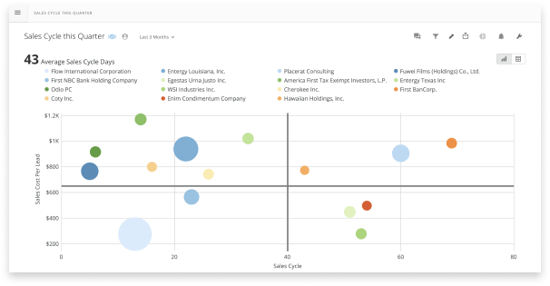
A bubble chart is a data visualization tool similar in nature to a scatter plot and is represented as the same icon in “analyzer”. Like a scatter plot, a bubble chart plots x,y points. It then uses the size of the point or bubble to convey additional meaning. You can gain insight from your data by seeing the relationships between the sizes of the bubbles along with their general location on the chart.
To build a bubble chart, you need three columns of data. Two columns will correspond with the values of each axis and will determine where the data will be plotted. The third column is the value that determines the size of each bubble. In analyzer you can specify a fourth column that includes the series data and will show up as a legend on the chart.
A bubble chart is very helpful when you want to illustrate a relationship with your data. Because of its unique nature, a bubble chart is able to plot data points in three dimensions, showing if the variables are related or if there is a pattern between the three.
When Should You Use a Bubble Chart?
Use a bubble chart to determine high-value measures and low-value measures. Is your company trying to understand how to prioritize projects? Chart out the cost of each project, the amount of time it would take to complete, and the estimated revenue. The projects with the largest bubbles that chart toward the bottom left corner will have the highest ROI for the company.
Or perhaps your company is trying to understand ‘What type of customer is most profitable for us?’. Using a bubble chart will help visualize the strengths of current customers. You could chart the cost of acquisition, the number of customer service calls, and the revenue from each customer. Add a fourth dimension by using color to identify a metric such as their place in the Fortune 500.
These charts can help reveal trends that may have been previously overlooked. The key story in the data is shown by clusters of bubbles or seeing any outliers. For example, once you have a way to visualize your customers, you can identify clusters of attractive features. Those with low cost, low customer service requests, and high revenue are attractive. You can focus your business’s attention on retaining those customers and targeting similar ones.
Using a Bubble Chart Visualization in Your Business
Bubble charts have a wide variety of business use cases. The key to effectively using a bubble chart is knowing which three data points will be most effective for a comparison. Make sure your bubble chart can present a trend where the size of the bubble is a key indicator of value.
Some examples of where bubble charts can be used to help visualize data include:
- Evaluating an investment portfolio. Chart all your options on cost, risk, and value to see different dimensions in the business relationships of each project. The bubble chart will show those options that have the lowest cost and risk with the highest potential return.
- Reviewing a marketing campaign. Use a bubble chart to visualize the statistics related to multiple ongoing campaigns. You can chart the cost per click, clicks or views, and conversions. A bubble chart can simultaneously highlight the highest performing ads that could have more budget added to them and the lowest performing ads that need to be adjusted to improve performance.
- Understanding employee satisfaction. Use a bubble chart to plot out data from an employee satisfaction survey. Show their overall satisfaction with their job compared to the number of hours worked and salaries to see if there are any notable correlations.
- Tracking store performance. Use a bubble chart on a map visualization to track revenue in geographic areas for each store. It will show which stores are top performers and highlight any performance clusters based on geography.
Using a Bubble Chart in a Dashboard
While a bubble chart can add another dimension to the story you are telling with your data, it makes it difficult to compare data specifically on its numerical values. In a bubble chart, you are comparing values across two scales: position and size. It’s harder mentally to understand the value of sizes and can get even more confusing if multiple bubbles overlap.
When building a business intelligence dashboard, keep that in mind. If you are building a dashboard to help evaluate how to prioritize projects, use a bubble chart to see trends between cost, time, and value. A bar chart can identify how many times customers request specific projects and a period-over-period chart can show how products are performing over time. This can help stakeholders identify additional factors that can weigh into their decisions.
Best Practices for Using a Bubble Chart
Here are some key points to consider when utilizing a bubble chart to visualize your metrics.
Avoid clutter.
As with many chart types, too many variables can make it difficult to find any meaning in the data. Use care when choosing the number of variables to chart. More variables and data on a bubble chart can make it difficult to compare bubble sizes or even see some of the data points since they could be overlapped by larger bubbles.
If you do have overlapping data points, make sure you use transparency on your bubbles so every data point can be seen and sizes determined.
Use area, not radius, to determine size.
When determining the size of your bubbles on the chart, calculate the size based on the circle’s area and not its radius or diameter. By scaling the bubbles based on the radius or diameter, you can misrepresent the relationship of the data because radius and diameter scale exponentially and will create a much larger area than other data points. That can confuse the viewer and will add a disproportionate perceived value to some data points.
Use a round bubble shape.
It can be tempting to differentiate your chart by using shapes like a square or a diamond. However, these other shapes can make it harder to distinguish the relative area of each plot point, diminishing the value of the bubble chart. Use a round bubble to plot your data.
Avoid negative values.
While a bubble chart can technically be used to visualize negative values, it can add a level of complexity to your chart that will confuse viewers. Since negative values have no area, it’s hard to compare the relationship between two plot points that are positive and negative. If you do have negative values, consider using a different chart type to illustrate that data.
The bubble chart is one of the best ways to visualize relationships between key points of data. It can help determine the best course of action for your business. To learn more about other charts and data visualization techniques, see our articles below.
RECURSOS RELACIONADOS
chart
Gantt Charts
chart
Forecasting Charts
chart
Radar Charts
chart


